GUI
Basic Structure
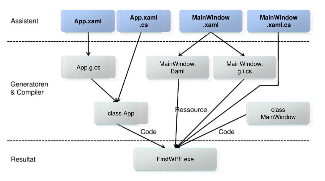
The App.xaml and App.xaml.cs is the equivalent to the main. In the StartupUri the start window is set.
<Application x:Class="WpfApp.App"
             xmlns="http://schemas.microsoft.com/winfx/2006/xaml/presentation"
             xmlns:x="http://schemas.microsoft.com/winfx/2006/xaml"
             xmlns:local="clr-namespace:WpfApp2"
             StartupUri="MainWindow.xaml">
    <Application.Resources>
    </Application.Resources>
</Application>
The following is the App.xaml.cs
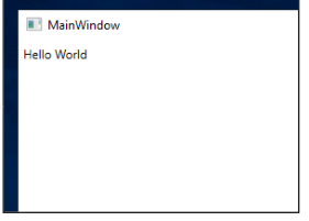
The following is the MainWindow.xaml file which defines the main window:
<Window x:Class="MainWindow.xaml.cs"
        xmlns="http://schemas.microsoft.com/winfx/2006/xaml/presentation"
        xmlns:x="http://schemas.microsoft.com/winfx/2006/xaml"
        Title="TestWPF" Height="300" Width="300">
    <Grid>
        <Label>
            Hallo World
        </Label>
    </Grid>
</Window>
The following is the accompanying C# class
XAML
<Window xmlns="http://schemas.microsoft.com/winfx/2006/xaml/presentation"
        xmlns:x="http://schemas.microsoft.com/winfx/2006/xaml">
</Window>
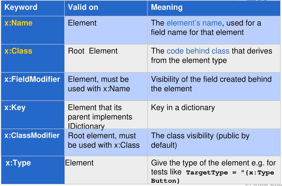
The default namespace contains the standard UI controls, where as the x namespace contains special XML parser types.
Content Property
The two buttons above are equivalent to each other.
Collection ItemsLogicalTreeHelper
Important Attribute
CLR Properties
<Window x:Class="WpfApp2.MainWindow"
        xmlns:datalib="clr-namespace:DataLib;assembly=DataLib"
        mc:Ignorable="d"
        Title="MainWindow" Height="450" Width="800">
    <StackPanel>
        <Label>Hello World</Label>
        <ListBox>
            <datalib:Person FirstName= "Stephany" LastName = "Nagel" />
            <datalib:Person FirstName= "Matthias" LastName = "Nagel" />
        </ListBox>
    </StackPanel>
</Window>
namespace DataLib {
    public class Person {
        public string FirstName { get; set; }
        public string LastName { get; set; }
        public override string ToString() => $"{FirstName} {LastName}";
    }
}
Dependency Properties
namespace myNameSpace {
    public class MyStateControl : UserControl {
        public MyStateControl() : base() { }
    }
    public String State {
        get { return (String)this.GetValue(StateProperty); }
        set { this.SetValue(StateProperty, value); }
    }
    public static readonly DependencyProperty StateProperty = DependencyProperty.Register(
        "State", typeof(String), typeof(MyStateControl), new PropertyMetadata(""));
}
Layout
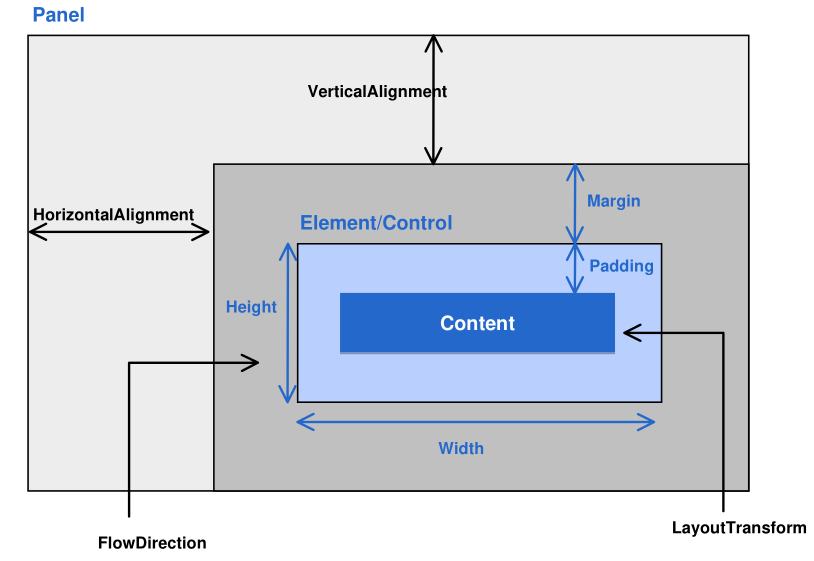
The Width and Height property control the width and height of a control. However, they shouldn't be set directly, as this can lead to layouts which cannot scale. Instead, MinWidth and MaxWidth should be used.
There is also DesiredSize, which is how large the element likes to be, RenderSize which is the actual size, and ActualWidth and ActualHeight, which are the components of RenderSize
Canvas
Children are arranged in a 2D grid. It's main use, is to draw graphics and it should not be used for placing controls
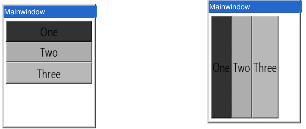
StackPanel
The stack panel arranges its controls either vertically or horizontally depending on the Orientation property.
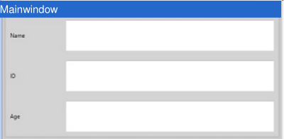
Grid
<Grid x:Name = "FormLayoutGrid" Background = "LightGray">
    <Grid.ColumnDefinitions>
        <ColumnDefinition Width="Auto" />
        <ColumnDefinition />
    </Grid.ColumnDefinitions>
    <Grid.RowDefinitions>
        <RowDefinition Height = "*" /> remaining
        <RowDefinition Height = "*" /> remaining space
        <RowDefinition Height = "*" />
    </Grid.RowDefinitions>

    <TextBlock Grid.Row = "0" Grid.Column = "0"
               Text = "Name" Margin = "10" HorizontalAlignment = "Left"
               VerticalAlignment = "Center" Width = "100"/>
    <TextBox Grid.Row = "0" Grid.Column = "1" Margin = "10"/>
    <TextBlock Grid.Row="1" Grid.Column="0" Text="ID" Margin="10"
               HorizontalAlignment = "Left" VerticalAlignment = "Center"
               Width = "100"/>
    <TextBox Grid.Row = "1" Grid.Column = "1" Margin = "10"/>
    <TextBlock Grid.Row = "2" Grid.Column = "0" Text = "Age"
               Margin = "10" HorizontalAlignment = "Left"
               VerticalAlignment="Center" Width = "100"/>
    <TextBox Grid.Row = "2" Grid.Column = "1" Margin = "10"/>
</Grid>
DockPanel
Arranges children horizontally or vertically to each other towards the edges
WrapPanel
Arranges children continuously horizontally or vertically, flowing to the next row/column
Data Bindinng
The following data object is used as an example in this section:
There are multiple syntaxes for declaring a binding in XAML:
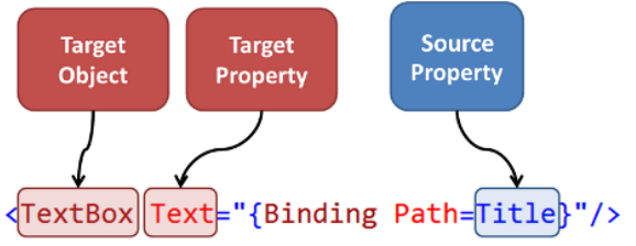
<Button Content="{Binding Path=Name}" />
<Button Content="{Binding Name}" />
<Button>
    <Button.Content>
        <Binding Path="Name" />
    </Button.Content>
</Button>
| Property | Meaning |
|---|---|
| ElementName | Specifies the name of the data soure |
| Path | The property to which the data is bound (e.g. Content, Value, Text, ...) |
| Mode | The binding direction |
| Converter | Defines a converter used to convert the data |
| Source | Reference to the source object |
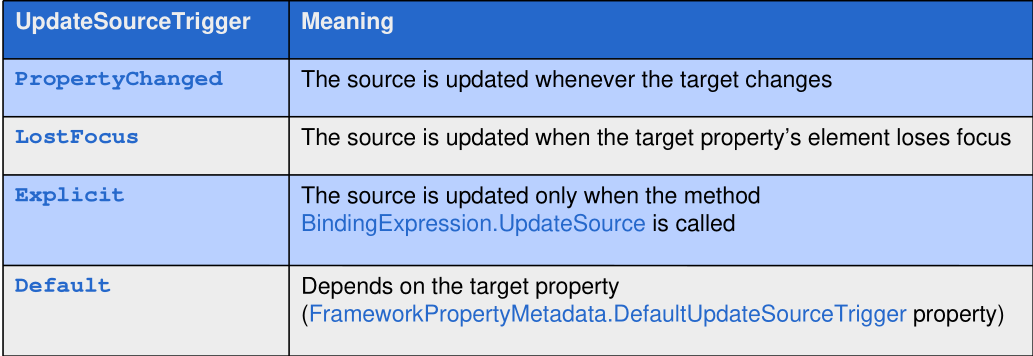
| UpdateSourceTrigger | When the data should be updated |
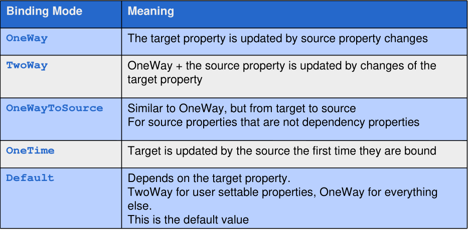
The following options exit for the Mode property:
The following options exits for the UpdateSourceTrigger:
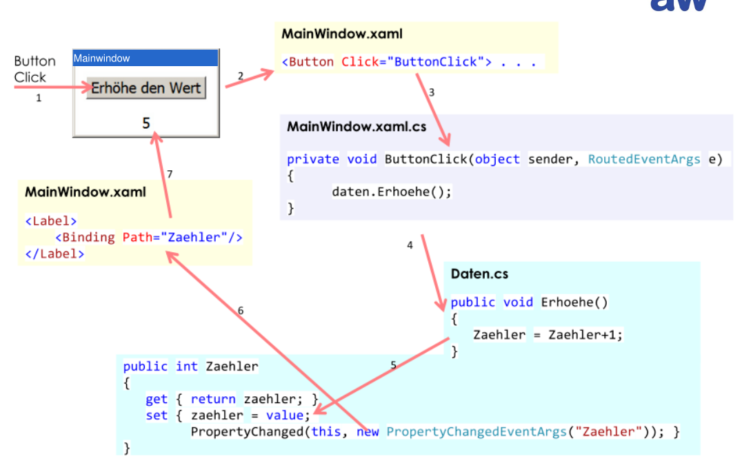
If we want to bind an instance of a Person to a UI, the instance has to be set to the DataContext attribute:
public partial class MainWindow : Window
{
    public Person p = ...;

    public MainWindow()
    {
        InitializeComponent();
        DataContext = p; // set data context to the person instance
    }
}
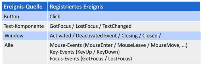
Events
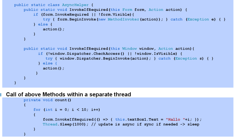
Multi-Threading
Model - View - ViewModel (MVVM)
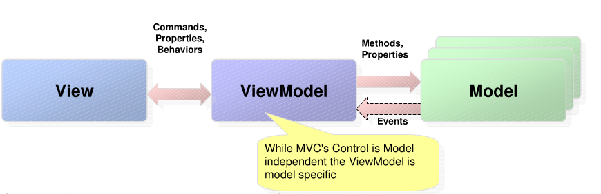
The model contains the business logic. The model can implement some kind of notification systems.
The View displays the user interface and has no or very little code. It does not directly interact with the model.
The ViewModel is the glue between the Model and the ViewModel and is model specifc. It abstracts the model for the view.
ICommand
Provides a command which the UI can execute.
public interface ICommand {
    event EventHandler CanExecuteChanged;
    bool CanExecute(object parameter);
    void Execute(object parameter);
}
There are some pre-defined commands, like Cut, Copy, ... for TextBoxes.